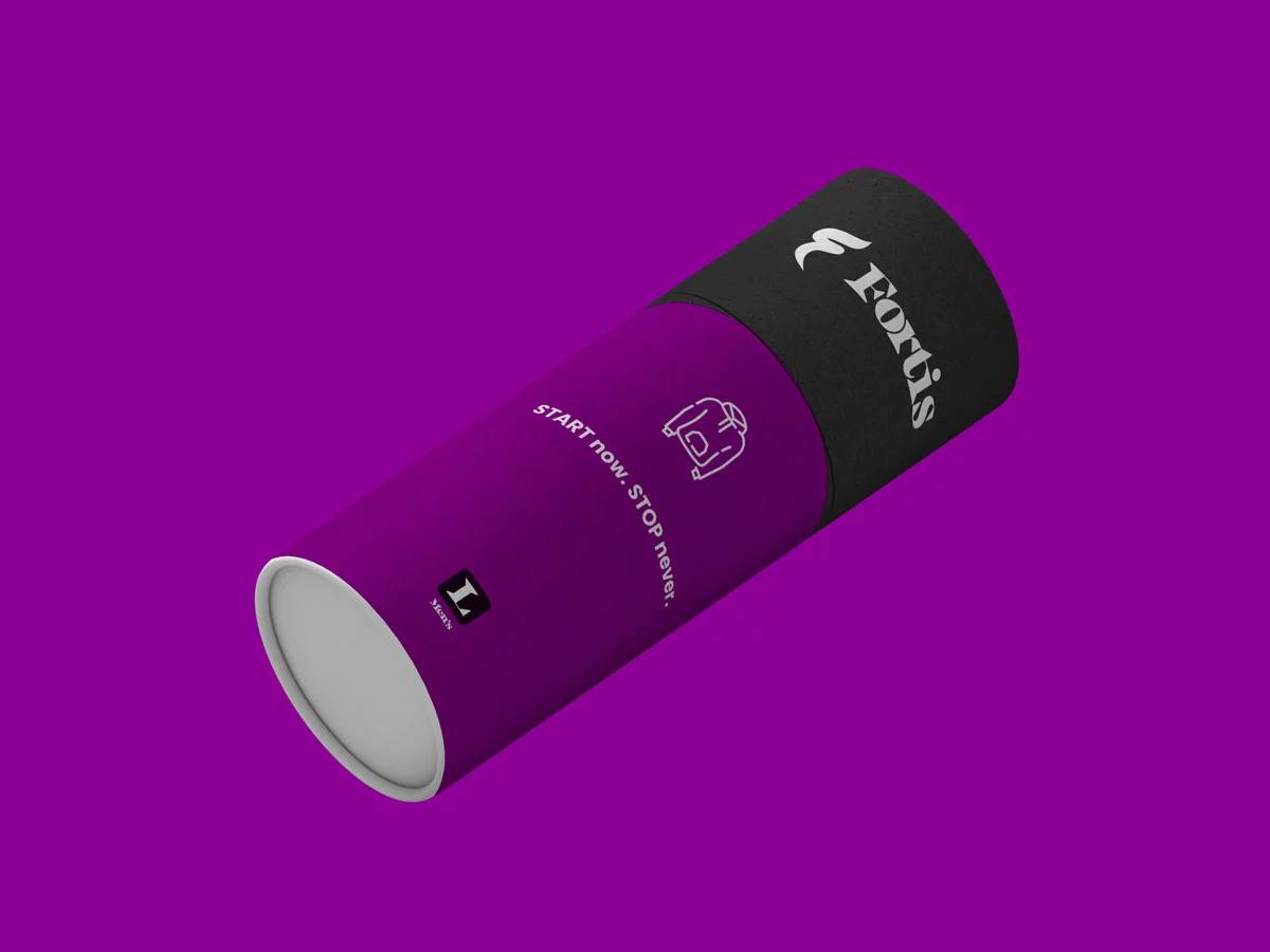
To help give the logo a dynamic feeling, I combined the concepts of the Olympic flame with a finish line ribbon to depict the F logo mark.
Logo Clearspace
To allow ample room around the logo. No matter how big or small, keep at least one F in the distance to other elements like graphics, text, and the edge of a document.
Logo variations and file types
A zip file that contained a guide that covered logo usage along with the following logo variations: Horizontal, Stacked, Icon, and Word Mark was given to the client.
Each logo variation came in the RGB color space for screen use and the CMYK color space for printed pieces.